CodeLab
2026
Rethinking how a 500+ member tech club finds, tags, and shares event photos
I designed a shared photo hub for CodeLab that helps members find photos from any event in just a few taps.
Overview
CodeLab needed a better way to store and share memories across a 600+ member network.
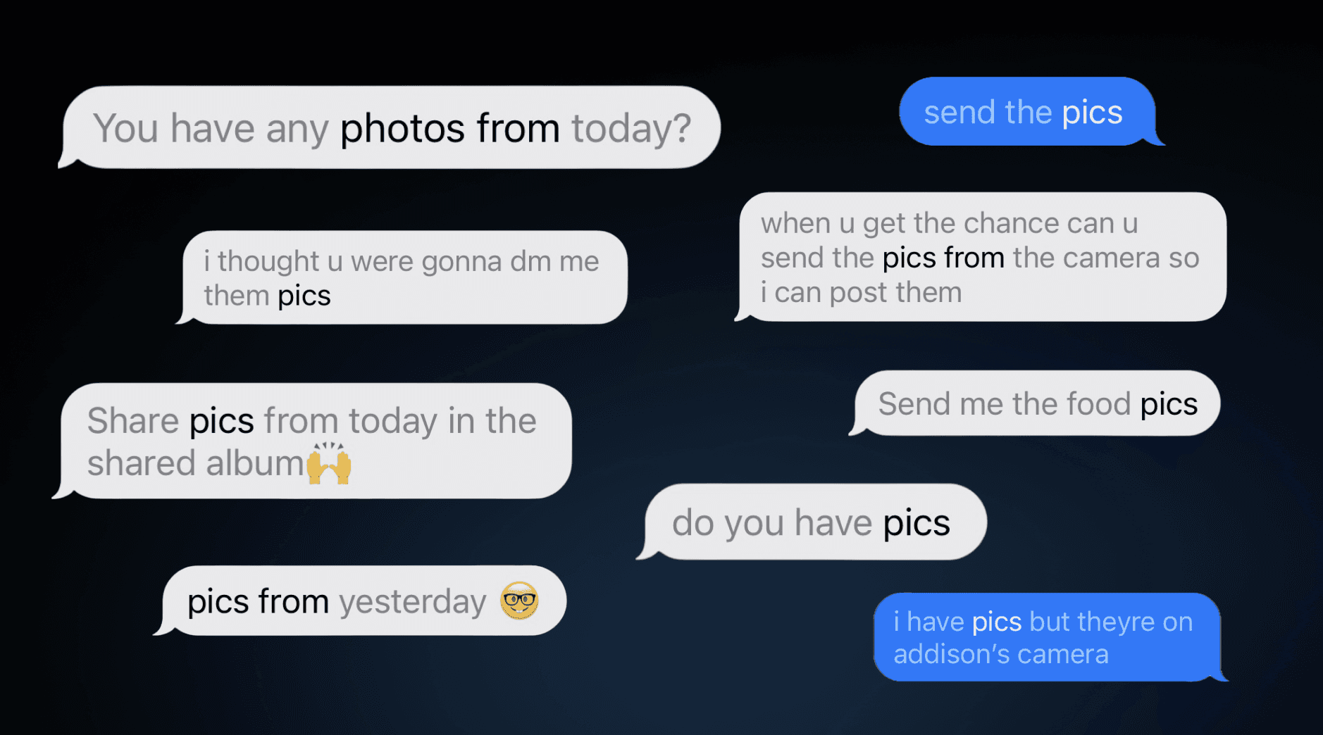
CodeLab is a 600+ member software development and product design organization at UC Davis that builds web and mobile applications for real-world clients. As a fast-growing community, CodeLab relies heavily on photo assets to document events, build culture, and power marketing campaigns.
My Impact
Authored and designed the end-to-end onboarding experience, album creation workflows, and landing page navigation. Directed information architecture to eliminate reliance on expiring cloud links and fragmented chat threads.





Problem
Finding photos felt unnecessarily difficult
Members struggled to find specific event photos, while organizers spent unnecessary time manually locating and sharing files across fragmented tools. Members couldn't easily find photos of themselves or past events due to expiring links and unorganized folders.

The problem statement:
How can we help CodeLab members easily upload, find, and organize team photos without doing boring manual work?
Solution
A shared photo hub built around how members remember
The final design gives every CodeLab event a home in one open, scrollable feed. Members can start browsing the moment they open the app, narrow things down with a single filter menu, or search for a moment in their own words. I’ll show the experience first, then walk through the research and testing that shaped it.

The final design: an open feed of albums, with search and a single filter menu always within reach.
See it in action

Browsing albums
The app opens directly to a feed of albums, and members can filter by event type without leaving the page.

Sharing within an album
Members can add photos, react to their favorites, and share an album from the same screen.

Searching by memory
Members can describe a moment in everyday language and find it, even without remembering the exact date.
01
An open, scrollable feed
Photo albums greet members as soon as they open the app, so they can start browsing right away with fewer clicks.
02
One tidy dropdown filter
All event categories live in a single menu, keeping the screen uncluttered while Professional, GM, Socials, Retreat, and Recruitment stay one tap away.
03
Search for every kind of visit
Keyword search helps members who know exactly what they want, and tag filters support those who are casually looking back on past events.
Research
Designing for members, not myself
I spoke with 10 members, including freshmen, active members, and alumni, to understand how they look for photos today.
Memories come first. Nobody searched by date. People described moments instead, like “that marketing workshop” or “the hotpot social.”
Context matters. Members recalled photos through an event type, a feeling, or the team they were with.
My goal was to support this natural, memory-driven way of searching while keeping the interface calm and the number of clicks low.
Competitive benchmarking & flows
To validate layout patterns, I audited visual-heavy platforms (Google Photos, iOS, SWSH and Partiful) to see how other platforms achieve clarity and fun when it comes to uploading media.
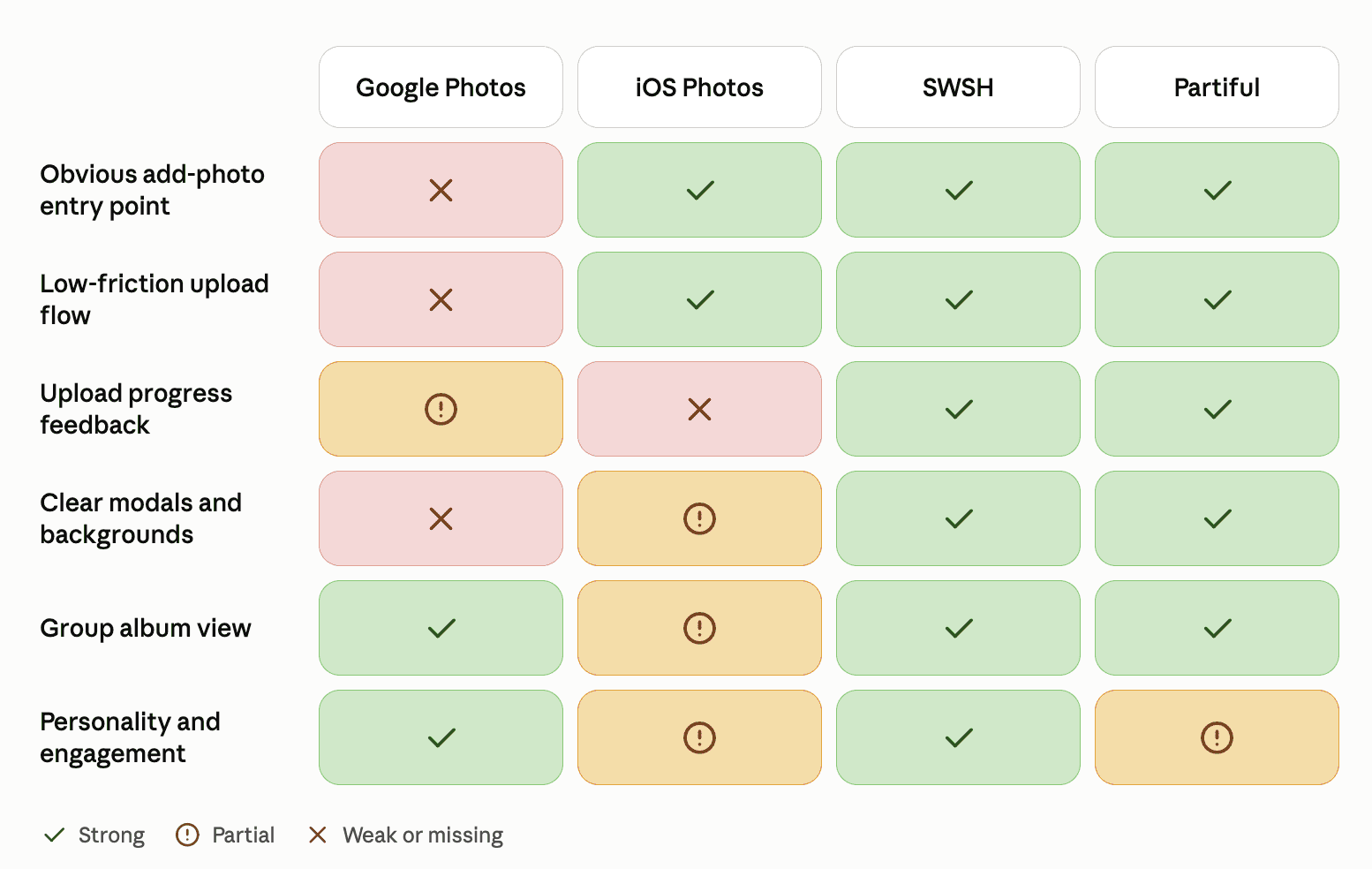
Most gave no feedback during uploads, leaving users unsure if anything was happening — including iOS Photos, despite its clean interface. Partiful solved this with a progress bar on every upload. We aimed to combine iOS's simple, low-friction interface with Partiful's upload clarity.
Testing & Iteration (A/B Validation)
To determine the most efficient architecture, I built two distinct prototypes and conducted 6 task-based A/B tests.

Version 1 · Horizontal filter tags
The idea
I placed every category, including Social, Recruitment, Retreat, GM, and Professional, directly under the search bar so members could filter with a single tap.
Why I tried it
I hoped that showing every option up front would make the archive feel open and easy to explore.
What I heard
In testing, the row of tags felt crowded. Members told me they had to work to make sense of the screen before they could even look at photos.

Version 2 · Visual category folders
The idea
I replaced the tag bar with large, image-led folders for Socials, GM, and Retreat, similar to a familiar media library.
Why I tried it
Giving every album a clear home seemed like a gentle way to reduce the clutter from the first version.
What I heard
The screen looked calmer, though finding a photo took longer. Members had to open a folder and back out again for every search, which quickly felt tedious.
What the A/B test showed me
4 of 6 testers preferred filtering with tags over browsing folders.
Stacking tags helped people narrow hundreds of photos down within seconds.
Folders made people move back and forth between screens, which slowed them down.
Tags reflected how members naturally remember events, by type, mood, and team.
Final design
Bringing the best of both versions together
Testing made the path forward clear. Members loved how quickly tags narrowed things down, and they appreciated how calm the folder version felt. The final design keeps both qualities: albums fill an open feed so photos lead the experience, and every category folds into one dropdown menu so the screen stays uncluttered. I also paired global keyword search with local tag filters to support both casual browsing and targeted searches.
Lessons
Designing around how people remember
My first version showed every option at once, and my second tucked everything away. Neither felt right to members, and the design that worked came from combining what each one did well.
Look beyond the polish. The folder design was the most visually refined, yet it tested the weakest, which reminded me to measure ease of use alongside appearance.
Test early and side by side. Comparing two directions with real members helped me avoid building a structure that would have frustrated them.
Follow people’s mental models. Members think in terms of events and people, so the archive works best when its structure mirrors that.
Key outcomes
Fewer clicks to a photo
Albums are visible from the first screen, so members no longer need to open folders to start browsing.
A calmer first screen
Five category tags now live in a single dropdown, which keeps the screen open and easy to scan.
Grounded in research
Every decision traces back to 10 member interviews and 6 A/B tests.
Room to browse or search
The design supports both casual reminiscing and quick, targeted searches.

