Design Interactive
2026
Pounce: helping people stay consistent with fitness, together
A concept app that makes tracking workouts feel encouraging and social. I designed the onboarding experience and the home dashboard.
Overview
Designing a fitness app people want to return to
Most people download a fitness app with real intentions. A few weeks later, the novelty fades, logging starts to feel like homework, and the app quietly slips off their home screen. Pounce is our team’s response to that pattern.
We designed Pounce over eight weeks as part of Design Interactive’s Spring 2026 cohort. It is a concept project, and our goal was to make staying active feel lighter, more personal, and more connected to the people around you.
My role
I led the design of onboarding and the home dashboard. These two moments carry a lot of weight: onboarding shapes someone’s first impression in under a minute, and the home screen is where they return every day.
Midway through the project, one of our five designers had to step away. In week six we reshaped ownership across the four of us, and every core flow still came together for the final presentation.
Problem
Motivation fades long before a habit has a chance to form
The people we spoke with genuinely wanted to be healthier. What they were missing was a reason to keep going once the first burst of energy wore off. Tracking felt tedious, progress was hard to see, and the experience rarely felt like it was built with them in mind.
How might we design a fitness experience that keeps people motivated to track, plan, and celebrate their progress?
The question that guided our work
Why people told us they stopped
2 in 3
of the people we interviewed were already using a health app, so the interest was clearly there.
42%
stopped using an app once a paid subscription began.
50%
left because the app felt too complicated or asked for too much manual logging.
Many people also described fitness apps as dark and crowded with data, and they told us they would welcome something brighter and easier to find their way around.
Solution
A fitness companion that celebrates every step together
Pounce makes tracking feel light and social. The app greets you with your progress, lets you ask a friendly AI coach for help, and keeps your friends close enough to cheer you on. Here is a quick look at the final experience before I walk through how we got there.

Home
Today’s goal, encouragement from Pounce, and weekly stats come together on one calm screen, with a single button for logging a workout.

Pounce AI
Ask Pounce for a workout idea or a summary of your week, and the answer arrives in a warm, encouraging tone.

Social
Invite friends to the gym, start a crew, and celebrate each other’s workouts with kudos.

Profile
Every workout becomes a post with its duration, volume, and a photo, so progress is easy to look back on.
Research
Listening before designing
None of us came from a fitness background, so we leaned on the people we were designing for. We interviewed people between 18 and 25, ran an online survey, and studied how Strava, MyFitnessPal, and Headspace keep their users engaged.
12
one-on-one interviews
47
survey responses
3
apps studied in our competitive analysis
What the survey told us
76.6%
said seeing progress, like stats and streaks, helps them stay consistent.
45.7%
said ease of use matters most when choosing a health app.
40.4%
mainly use wellness apps to track their workouts.
Three needs came up again and again
Simplicity! People wanted an app that asks very little of them and feels like a supportive companion.
Visible progress. Seeing streaks and stats was the most common reason people gave for staying consistent.
A personal feel. People wanted encouragement that felt like it was meant for them.
What we learned from existing apps
Strava gives people clear goals and rich data, which can feel demanding for someone who is just getting started. MyFitnessPal has a lively community, though several beginners told us its feed felt intimidating. Headspace shows how welcoming a calm, well-paced experience can be, but it offers little sense of progress.
We saw room for an app that makes tracking effortless and surrounds people with encouragement.
Ideation
Giving the experience a personality
We clustered our research in FigJam, reframed our findings as “How might we” questions, and weighed every idea against what we could realistically build in eight weeks. One theme kept surfacing: screens full of charts and numbers made fitness feel clinical, especially for beginners.
That observation led us to Pounce, a cat mascot who carries the warmth of the product and cheers people on along the way. We also kept navigation to four tabs, Home, Social, Stats, and Profile, so the app always has a calm, familiar anchor.
Testing
What usability testing showed us
We tested our high-fidelity prototype with college students whose fitness experience ranged from casual to very active. Each person created a workout group with friends and logged a workout from the home screen. Everyone completed both tasks, and their feedback showed us where the experience was still asking too much of them.
“The concept is really cute, but as a first-time user I wasn’t sure where to begin or how Pounce connected to the experience.”
Usability test participant
Refining the home screen
Before
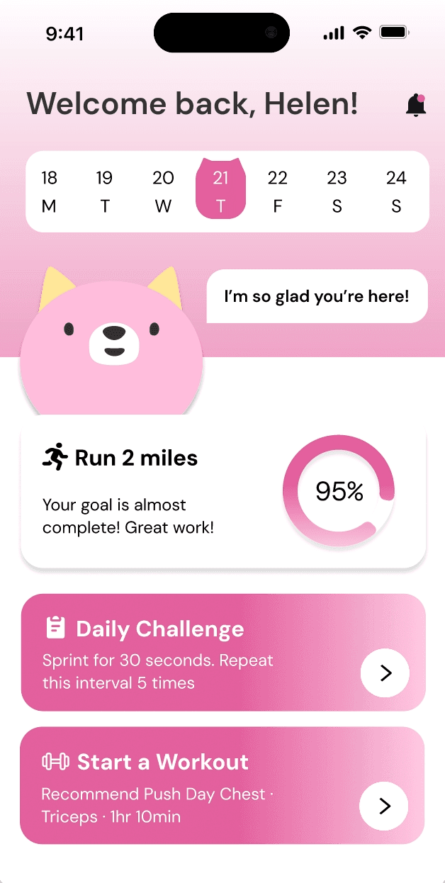
After

Stats above the fold. I moved Your Weekly Stats higher so steps, calories, and heart rate are visible the moment the app opens.
One clear action. Two competing cards, Daily Challenge and Start a Workout, became a single Log a Workout button, which made the main action easier to spot.
Encouragement with purpose. Pounce’s greeting now responds to progress. “I’m so glad you’re here!” became a countdown toward the day’s goal, so the encouragement feels earned.
Giving the mascot a purpose
Before

After
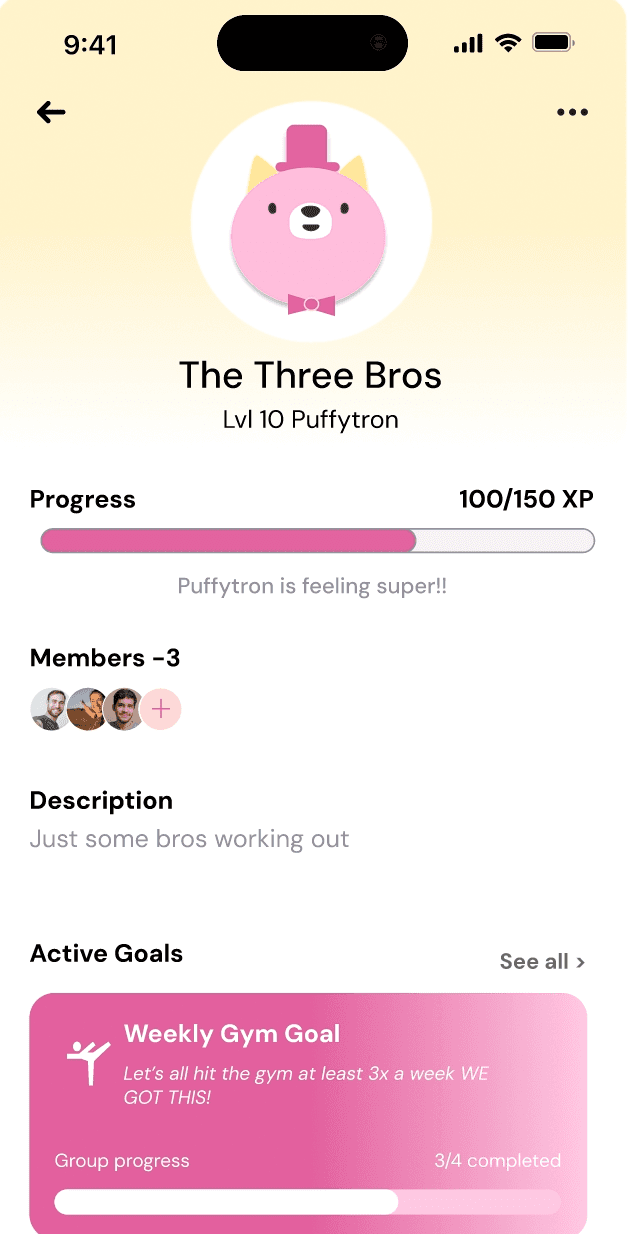
A shared companion. The crew page originally showed Pounce as a static illustration. We turned it into the group’s companion, with its own name and level.
Progress everyone can see. An XP bar fills as members work out together, and Pounce’s mood reflects how the crew is doing.
Goals in context. Active goals, such as a weekly gym goal with group progress, now live right on the crew page so everyone knows how close they are.
Design details
Designing the first impression and the daily return
Onboarding and the home dashboard were mine to design, and they carry the most emotional weight in the app. Onboarding decides whether someone feels welcome in their first minute, and the home screen is where they come back every day, so I want to share the thinking behind both in a little more detail.

Onboarding
A personal welcome
The first screens set a warm, friendly tone and introduce Pounce before asking for anything.
Goals and needs
People share their activity level, goals, and timeline through quick selections, so the app can tailor plans from the very first day.
A warm, playful voice
Cat-themed writing throughout makes setup feel like a conversation with a friend.
Home
Everything at a glance
Today’s goal, encouragement from Pounce, and weekly stats sit together, so people can see their progress in one place.
Pounce AI, one tap away
Fitness questions can go straight to Pounce from the navigation bar.
Log a workout
A single, clearly labeled button makes adding an exercise quick and satisfying.
A design system built to feel encouraging
We built a small design system so every screen would feel consistent, approachable, and encouraging. DM Sans gives the interface a clean and friendly voice, and a palette of pink, blue, and yellow brings energy while keeping information easy to read. Rounded buttons, icons, and cards keep the experience soft and welcoming, which matters most for people who are new to fitness.

Typography, color, icons, buttons, and components from the Pounce design system.
Reflections
What this project taught me
Designing for people unlike yourself. None of us were fitness enthusiasts, so we relied on 12 interviews and 47 survey responses to guide decisions we couldn’t make from instinct.
Choosing focus. We considered adding diet tracking, but people consistently preferred a focused app with fewer, well-executed features. Narrowing our scope made the experience simpler and easier to use.
Adapting when plans change. Losing a teammate in week six showed me how much clear ownership and well-organized files help a team keep moving.
Our judges highlighted the color palette and the mascot as the reasons Pounce felt approachable for beginners. Ken Skistimas, Director of User Experience at ServiceNow, also asked a question we are still thinking about: what would Pounce look like if AI were woven through the entire app?
Feedback from presentation day

